This creative lady has recycled lanterns with fresh paint and created amazing fixtures for a fraction of the new cost. Go see what she's done!
First off, if I had such a hallway I'm be in heaven. But if I had a hallway AND these amazing bookshelves, I think my heart might not be able to handle it! I think I will always be remembering this idea of combining what could be a boring hallway into a library/showstopper. Amazing.
These cabinets just take my breath away. Big, oversized china cabinets are to be had for very little on craigslist right now if you're willing to freshen them up a bit with paint. I love the bold use of color in these rooms. How about the stunning blue inside the black or the white contrasting with the gray? Wow!
I don't usually make many Christmas crafts, but I love this wooden star. The glass knob for the center is just perfect. I might just be patient enough to try making one.
All Things Thrifty
See those frames on the top left and lower right? Well, they're not frames. They're actually chair backs! Cool, huh? Now I'm on the lookout for cheap, broken-down, old chairs to turn into gorgeous frames like this.
I'm not really a ruffle kind of girl, but my eye was drawn to the boxpleats on this charming tablecloth. Love it!
I Love these collections of nursery/girl's rooms.
Pink, Taupe and touches of Navy! Wow, love this combination!
Don't let that flat screen take center stage. I love how this one has been blended into a gallery wall. This is so easy to do!
My own personal days of a nursery are over, but I am in love with this wall treatment. A chinoiserie pattern has been painted in white on a pale, gray background and accented with pale pink and blue. Just gorgeous. I'd even do this type of wall in a dining room in these subtler colors than the typical bold, rich chinoiserie colors.
There is a lot that I love about this room. I never feel like I have enough wall space for all the art I'd love to have. I love how that didn't stop the designer here. Art is layered, above and below the wainscoting and even on the floor. More pieces decorate the bookshelf cabinet and even ON the cabinet. I also love the books stacked under the sofa table. A living room has taken on a cozy, den or library feeling while remaining light and comfortable. I just want to curl up on that couch and read!
Another example of what could be a boring stairwell turned stunning by a combination of the horizontal planking, the art grouping and the stunning light fixture!
Want that layered look to your gallery walls that you see in Pottery Barn? This blogger shows how to do it yourself, as seen with this arrangement of mirrors.
I just love gallery walls and I love the variety and fun you can have with them. Some love the symmetrical, some the randomness. I love this for how unique it is! Perfect for a low-ceilinged hallway!
If only I still needed a kids playroom/craft room! I love this industrial-style room with the school chairs and stainless-topped table. Of course, I'd HAVE to have those metal bins and that HUGE bulletin board...
via honey and fitz
I might just have to do one of these Ombre dressers! Darling.
Pottery Barn
How about taking those "dime-a-dozen" oak frames found at Goodwill and stain them with dark walnut and mat them with burlap to achieve this look.
Restoration Hardware
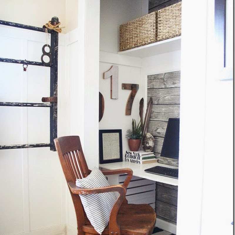
I was following a guy on the interstate the other day that had a pair of red corbels probably the size of these in his truck. Oh, how I wanted to pull that guy over and insist he give me them!!! I'd love an office desk like this or get rid of the run-of-the-mill kitchen desk and do something like this!
Okay, we're seeing these book page wreaths everywhere around the internet. I actually don't like most of them. I did find three that I really like:
Karen Blackburn
She varies her rolling method of the paper and uses black ink on the edges. I like that it's full, yet not perfectly round, with pieces sticking out in a more natural way.
Lovely etc.
I like the leaves of this one!
What about a DIY Quatrefoil rug for a fraction of the price of a store-bought one? This gal shows you how.
I've always been hesitant to make one because I know these IKEA ones are the thinner kind that can slide all over. Well, I'm not afraid anymore. Look at this idea of how to give yourself a non-slip backing:
via Loving Your Space You just add lines of acrylic caulk, let it dry and wowser, no-slip! I'm anxious to try is sometime.
Well, that better be it for now. I have way more than I thought. I hope you were inspired and found a project or two to make your house YOU!


