Monday, July 13, 2015

Internet Inspirations

I haven't put up a collection of Internet ideas for a while, so I've got quite a few.

I love the white, the dark stain, trim and that fun stair runner!

There are lots of these fun tutorials going around teaching how to make these awesome pipe shelving units.


Not using your fireplace or need to block the kids from using it? This gal cut the spines off old books and glued to a piece of board and inserted it into the fireplace box.

Gorgeous old upright piano that could be fixed, so it's gorgeous wood frame was redesigned into a desk! Brilliant and quirky.

Who wouldn't love a darling bunk room like this?
Tracy Hardenburg Design

While all neutral, the textures really draw me in and says, "classic and grown-up" to me.

For a small room, these built-ins would be amazing around a bed.
via La Dolce Vita

Love this sign! I might have to make something similar to this.

White kitchen? Yes, please! Wood island? Yes! Antique Blue Hutch? YES!

Great ledge/picture wall idea. What a great way to personalize your home with style.
India Hicks

One of the first "color" kitchens that I really think I'd never get sick of. This blue finish is just gorgeous. Paired with the marble counters and hexagon backsplace and touches of brass, it's gorgeous. 
K Marshall Designs

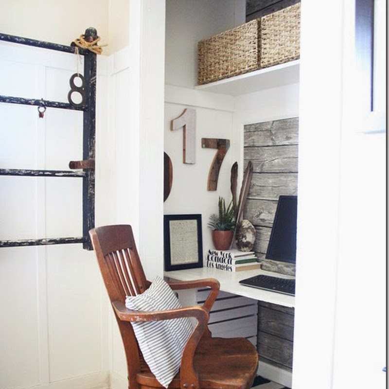
This walk-in closet was turned into the cutest playhouse for some lucky kid's bedroom.

I have GOT to make this clock. A brilliant tutorial.
My Love 2 Create

Easy, yet classic, entry made with stock or used cabinets.


This pantry is so perfectly organized and lovely to look at. For those homes with the pass-through laundry rooms, this would be so nice!

Another built-in hutch (actually I think that's the fridge) to die for.

These would be so easy to make for a fun gift.

Since I often upholster my furniture, I love finding new welting ideas. Love the flat edges to these cushions.

Want a great tutorial of how to get that weathered oak stain look on your furniture? This gal has it figured out.


Oh how I wish I'd seen this darling Bandolier idea for my little pack rats when they were little. Great tutorial on how to make one.
Whip-Stitch Tutorial


Don't you love the internet and all the amazing ideas out there?


Friday, June 19, 2015

New Stacked Stone Fireplace Surround


Our "new-to-us" already had so many beautiful updates done by the previous owners (such sweet people!) However, after a year of looking at the builder grade, peachy tile around the fireplace, I'd had enough! It doesn't really bother me too much on the floor, but somehow with it being up on the wall and center stage, it drove me nuts!

 Taking a hammer and pry bar, I quickly got rid of it (and boy, is demo therapeutic!) I had to not only remove the tile, but also cut out the dry wall it was adhered to. 

The newer stacked stone required cement board to support the additional weight. Once the wall was opened, we found a surprise: a live outlet box that was never connected!What? My dear husband moved it out of the line of where the new surround was going and connected it up properly. We now have another outlet, conveniently placed now for christmas lights on the mantel or whatever.


After attaching new cement board, we went to town laying out on the floor how we wanted the tiles arranged.

 Then using a wet saw, we made a few cuts until we got it all how we wanted. Then it quickly went up using cement and a little tape to hold it for a few minutes while it set.

 I love, love the texture and colors. It has enough of the beige colors to match the existing floors, but brings in the cooler gray shades I'm moving the house towards. Eventually we'll replace all the floor tile, but for now, the rooms focal point is no longer peach!!


The chairs got a facelift as well. I fell in love with this grain sack fabric and recovered the cushions!  The old TV cabinet got a light look with some watery blue paint. The room feels so much lighter and closer to the coastal cottage feel the house seems to want.


The whole project came in at right about on $100. What a difference and upgrade!

Thursday, April 30, 2015

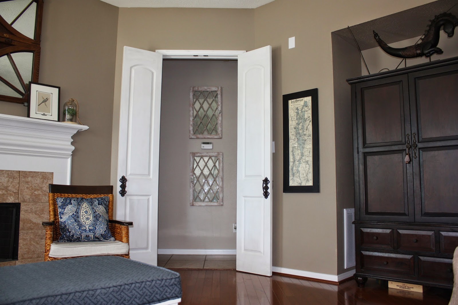
New Doors for Our Houston Home

Projects are moving forward slowly around here. Life (and the Good Lord) sometimes make us slow down some and enjoy the ride. I finally put the wax on my new 9-ft doors that we added to our living room. We decided to add doors to this opening because our master bedroom is right through that opening to the left. With all hardwood and tile on the main level, sound carries really well into our room. Our three high schoolers are up really early and it's just too loud!

 I stalked our local Habitat for Humanity ReStore until I found a pair of used doors that would work. I was holding our for something tall so that all the openings and doorways were at the same height. That opening to the master and hallway always looked too short and squat. 


My husband had to expand the opening up and reinforce the sides to support the new height and weight of the doors. 


You can see here how low it was in scale to the TV opening. 

Ahh, much better. Everything is the right scale now.


 I'm not happy with what you see right through the doors. Yup, the builder had to put the downstair's thermostat smack in the middle of the opening. Arghh! You can't cover it up or it won't read correctly and throw off your cooling and heating. And it's not an easy thing to move. So for now, I threw up some old windows that I had. I think the frames need to be darker to stand out more in that shadowy hallway. I might try staining them darker.


 I found some fun handles at Hobby Lobby to lend a vintage/antique feel to the doors. Ideally I would have loved to find some gorgeous antique doors, but alas, too expensive and hard to find.

Since I haven't posted any real pictures of my living room, I'll throw a few now. My rug is too small for this new space, but that's not in the budget any time soon. I can't stand the tile around my fireplace so I just accepted an upholstery job to pay for new stacked stones. Neither my husband or I have done anything like that yet, but we're up for tackling it if it'll save us some money!


Aside from a new rug, down the road the floors will need to be refinished or replaced as there is a fair amount of damage to them. I'd also like to lighten the paint and cool it down some, but it had recently been repainted and one area kind of leads to another, making it a bigger job and cost than we need to do right now. After the project of adding the stacked stone around the fireplace, I'm looking to beef up and add some architectural interest to my kitchen island. A fairly small and inexpensive project, but one that'll add some nice contrast to the kitchen. Fun projects I'm excited about, but that I have to tackled slowly with my other responsibilities right now! It's so fun to add your touch to each home and make it yours!

Friday, February 6, 2015

Our Houston Eat-in Benches and Cafe Curtains

Well, 6 months goes by way too fast! Worst blogger ever... Oh well. I never meant this to be a business or to rank high in followers. Just a place to share. We're well settled into our new home and already love the wonderful people here. I am resolved to share a few rooms that I've been able to decorate so far.  There are still a few projects I'd like to do, but I need to pace myself for time and money!


I asked right away for my birthday to have built-in benches made for our eat-in kitchen.  It was a smaller space than our last house and I knew it'd be a perfect candidate for benches!  I love how they turned out! We followed the basic plans found at The Hunted Interior.


 We just made a few changes in length and beefed up the supports a little more. Otherwise, it's a great plan. I chose this style because I didn't need the kind with storage and I wanted to keep the look lighter.  It's also nicer for the kids to swing their legs under. I upholstered some cute cushions for them. I wish I could have done the cute polka dot vinyl like the Hunted Interior did, but I couldn't swing the price tag.  I just used some inexpensive Premier Prints fabric and the scotch guarded it to death!  If anything gets on it, it has so far come right out!

I love the shape of the supports. And look at my cute barley-twist table and chairs. I found it on craigslist back in Chicago for a killer deal. I painted and reupholstered the chairs and restained the table.  It's oval shape fits this corner just perfectly.


Because the wall with the double windows just faces our sweet neighbor's brick side of their house, I knew I wanted to do cafe curtains.  It gives us some privacy, yet still lets light in up top.  I found the perfect grain-sack style fabric and double pleated the panels and hung with rings. They're a fun touch to the kitchen. Open or closed, I love them.


You wouldn't believe how many teenagers we've been able to squeeze around this table now! We love it. 

I also did a quick project of re-doing the stools at the bar.  They were just a basic stained saddle seats, but a real orangey finish.  I sanded down the tops, stained them darker and then painted on some grain-sack-inspired stripes and numbers. I chalk painted the legs and voila, cute stools.


I'll be adding more photos of some of the other rooms as they are so far in the coming weeks. We're really enjoying our new home and exploring the beautiful Houston area.


Related Posts with Thumbnails