Enough is enough! Yup, it's time to tackle the eye sore that we call our "den." Right off our front door is our den. It has become a collecting area for crafts, kid's homework, and it's UGLY.
We've squeezed two computers into our computer armoire, yet it's just not comfortable for the kids to work at.
With four teenagers needing the computer almost daily and another coming from Austria as an exchange student, I'm ready to change things up to work better for us. Armoires are supposed to keep it all neat and closed up, right? Not ours. The doors never close and you always are greeted with this view from the front door:
Lovely, huh? While I loved the existing paint color, after 8 years it's got a lot of wear and tear showing. Plus, I'm just ready for a change. The only thing that I plan on keeping in this room is this gorgeous library table I inherited from my Mom:
I love how two chairs can be used from either side. It's a great work area. It could use a little freshening up, but otherwise, it's in great shape and a unique piece.
The bookshelves are nice, but what I really need is closed storage for my fabrics, paints, and all those off-season decor pieces. It seems to always look like this:
Love the shelves, but they've got to go. A narrow cabinet with DOORS will go in it's place. I'm scouring craigslist for just the right piece to refinish.
In place of the computer armoire, I'm going to build/piece together an L-shaped desk. I want the base and counter top to look like this office by Miss MustardSeed:
I want the simple, white cabinetry and the gorgeous wood top. It'll be a big work area, enough for 3 kids to work on the computers. Keeping the cabinetry light and airy will help the den not feel crowded. I was going to build my own, but instead plan on using two nightstands to anchor the two ends of the the "L." I'll use Ana White's plans to build a corner cabinet to house two CPU's.
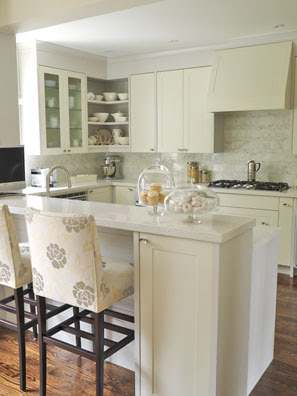
I want the top to have more closed storage, but also a nice architectural element since it's seen from the front door. I don't want it to be too sterile and devoid of style. I'm using this kitchen as my inspiration for the upper area:
Flea Market Trixie
For the uppers, I have already found some great high-end kitchen cabinets at a local kitchen outlet for unbelievable prices (Seigle's in Elgin, for you locals.) There will be a cabinet to anchor each end to provide closed storage for all the office junk. I will have to build a corner unit, probably leaving it open for some baskets and decorative office items. Connecting the three cabinets will be the shelves. The cabinets I've found need a bit of crown moulding to dress them up a bit more, so I'll hit up my favorite Habitat ReStore for their great prices on that! Going for something like this on top:
And this on the bottoms of each cabinet:
Whatever color I paint the walls, I'll keep it light to give a more spacious look. I'm torn between a creamy greige or a nice gray-blue color. I'm excited to pull this together once I've found/built all the main pieces. My goal is to have it done before the start of school.
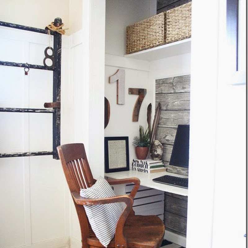
Here are some inspiring office ideas that I found will hunting the web. Enjoy:
Keep checking back for updates on my perhaps slow progress of transforming our unorganized and unattractive den to a useful and attractive space.


