Wednesday, December 19, 2012

Knock-off Aidan Gray Chandelier

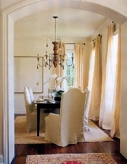
Ever since I first started seeing the Aidan Gray Chandeliers popping up on decor sites and in the mags, I've loved the antique-look of them.  They have delicate, spindly arms with iron and gray/white distressed finishes.  They look like something you picked up in a flea market in France or Italy.  What I love about them is that they can go with many different styles.  I've seen them in the fancier Italian or ornate rooms to cottage to shabby chic to french country to vintage.  They have visual punch without being overly heavy.
 
Cote de Texas
Cote de Texas
 
There are other versions of turned wood and metal by other makers and different styles.
 
via cote de texas
via pure style home
 
 
11 magnolia lane
 
in the fun lane
 
Horchow


Restoration Hardware
 
Tami owen
 
 
They range from $3000 to around $1400 for the Aidan Gray ones.  While the Aidan Gray are considered "reasonably priced" that's still about $1000 above what I could ever spend.  I really wanted one for my newly redecorated den, so I looked for some alternatives.
 
This Low-priced Option  is $400 and my Mom got it for closer to $300 on Cyber Monday.
Salento 9-light by Quorum
 
This one is $300:
Salento 6-light by Quorum
 
 
And then I found my budget one: $110 (I used a discount coupon and got it for $90!)
Cost Plus World Market
 
 Yup, that's my price for this project!  It had the smaller scale I needed for this room and the spindly arms so that it didn't hog the room visually.
 
(messy desk, sorry.  The teens are in the middle of finals.)
 
 
The one down to this light is that it has this ugly black wiring that is just plain weird.  It sticks out way too much.  Luckily, I only have a few inches of it showing.  If I were to use this as a dining light, I'd either paint the black wire or use a cloth cord cover.
 
Lovely holes, huh?  The builder didn't put in any wiring for a light in this room so my hubby had to cut a few holes to run wiring.  Patching comes next!
 
You can see the fun gray distressed finish.
 
I'm very happy with this finishing touch for our den.  Patch the ceiling holes and hide the computer wires and we are done in here!!! YEAHHH.



Friday, November 9, 2012

The Den: Phase Two complete

As you know, we've been re-working our den to meet our growing and changing family needs.  If you missed the previous post you can read about it here.  We lived with it for a little while like this:

 
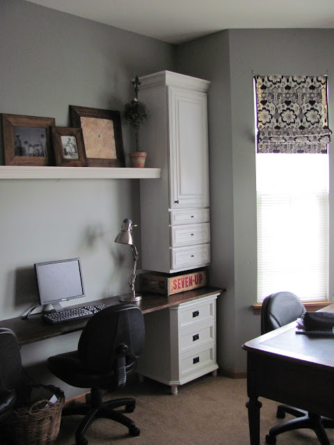
Now, it looks like this:
 
 
The Amazing Hubby built that upper corner unit to give some shelving and storage.  He built a shelf on each wall, bridging the 3 cabinets and faced them with some moulding.
 
 
We found some nice chunky crown moulding at our Habitat ReStore to dress up the tops of the cabinets.  It really makes them look more finished and custom and cost us a whopping $5 if I remember right.


I found these thick, wood frames at Hobby Lobby.  They come unfinished so I stained them to look like the expensive ones I loved at Pottery Barn.  I've found some old black and white photos of my family and still have to get some from my husband's side.  I like the retro look it gives while still meaning a lot to our family.


I decided to raise my faux roman shades up one more fold to let in a bit more light.  You can just barely see it in this picture:
 
 
We're so happy with how it's turning out.  I can't even tell you how much more our teens use this room now.  It just works so much better for us than before.
 
The last things we need to do to complete it are:
1. Cut holes in the lower corner cabinets to feed the computer wires through and neaten all that up.
2. Install wiring for a ceiling light (yup, the builder didn't put one in- so stupid!)
3. Install new light fixture for better work lighting (I'm so excited for this step- I've already found a beauty!)
 
I'll keep you updated.


Friday, August 31, 2012

Design Trend: Bobbin Chairs

     Bobbin Chairs have been around since the 17th century, but lately I'm seeing them in a lot of room designs.  They have a fun shape to add a textural element in a room without being oversized.  They usually have an upholstered element that is easy and inexpensive to change to an updated look.  I've found a few inspiration photos of Bobbin Chairs for you to see:


Berkley Vallone Designs
 
Massucco Warner Miller
 
Mrs. Howard Personal Shopper
 
Phoebe Howard


Atlanta Homes
 
via ivydeleon
 
via style beat
 
caitlin creer
 
 
Aren't they lovely?  See how well they fit in to so many different room styles?
 
I just found my first Bobbin Chair and it turned out like this:


I'll definitely be on the lookout for more Bobbin Chairs.  I love the look of the darker finish and am anxious to try that look.

Related Posts with Thumbnails