When deciding how to decorate a room, sometimes all you need to do is look to what you love. Our formal living room needed to be a quiet place where the kids could practice their instruments away from the noise of our more "active" family room. Our home's floorplan originally called for this room to be the dining room and what we're now using as the dining room, was the "formal" sitting room. The problem was, it was right next to the family room and the t.v. Not a very quiet room. So we swapped the two light fixtures and voila, our problem solved.
Our Old Formal Living room turned Dining room:
(yes, that's an older picture from around Christmas time. Sorry!)
(opposite side view)
The old Dining room turned Formal living room:
My Husband and two daughters play the violin, the twins play clarinet and I play piano. Our obvious decor choice was to use some old instruments we've found on the focal wall. Working with a rug I already had, I painted the wall behind the neutral couch a deep purple. I like using just one wall of color because it's so easy to change the look when you're tired of it (which I'm just about there. I'm on the lookout for rug to inspire a new color scheme.)
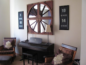
I found some old windows in my hometown in the Adirondacks of NY. Using a free mirror from Habitat ReStore, I had it cut and mounted it with mirror clips to the back of each window frame. I'm still not happy with something about the arrangement, so I'll keep tweaking it (maybe new frame color or spaced apart?)
I bought an inexpensive mini-chandelier to echo the dining room's chandelier and to also make it easy to envision this room back as the dining room should be need to sell. I fell in love with this purple fabric but it was incredibly expensive. I sprung for just 2 yards to use as the top sections of the drapes and two throw pillows. I found this delicious, crinkly fabric for the bottom section of the drapes and lined them for privacy and the sun.
I've been lucky to go to Paris twice and each time I found an old, cheap violin to bring home as a souvenir instead of a boring, little Eiffel Tower. It fits in with my decor, has that vintage feel and reminds us of our trips. A friend saw our lonely two violins and gave me the other three that his closed-out store was getting rid of! Yippeee!
Another friend gave us an old Clarinet.
When moving from Colorado to here in Chicagoland, I had a garage sale to get rid of all the odds and ends and furniture that had seen better days. I made just enough to get two of these beauties from Pier1. They're just the right size for any room, comfortable, easy to slipcover, and add just the right amount of texture to the room. I think I've had these chairs in every room of the house before they found a home here!
I've found that when you use things that are part of your family's history, it make the house a home. It illustrates your story and makes YOUR home unique to YOU! What do you like to do? Where do you like to go (or would if you could)? What color do you love? Now find objects, materials, colors, fabric and art to show that. You don't have to go all "theme-y", just touches around the home to put YOUR stamp on the home.
Now I NEED YOUR OPINIONS!
I just made another set of vintage train signs from some garage sale frames. I stuck them up on either side of the mirror above the piano. What look do you like better, with or without the signs?
Before:
After:
Jen suggested this way maybe:
Leave me a comment to let me know what you think. Thanks!!! Next post I'll show you what I did to an old trunk I had in the basement and how I personalized it...


I like it better with the signs, doesn't look so wagonish.
ReplyDeleteLUV it with the signs!
ReplyDeleteIt looks better than I had imagined. I love it Erin!
ReplyDeleteI think the bottom picture with signs and rotated mirrors is GORGEOUS!
ReplyDeletegosh that's a tough decision it's such a fun thing to work with! I like the signs by it for sure but I think I actually like it in a circle a little better- it seems more harmonious and not the center of attention in the room. As a circle it looks like a window which opens up the room. But I really have zero decorating talents so my opinion isn't worth a whole lot!
ReplyDeleteThis looks great. I love it with the signs.
ReplyDeleteI'm hosting a blog party right now and I'd love it if you stopped by and linked up. Hope to see you at Saturday is Crafty Day!
I love the old windows. The subway signs definitely help balance out the wall and add some height on the sides. I think I like them arranged in a circle. Maybe as the Nester says, just live with it for awhile and try the mirrors rotated if it still doesn't feel right. The rearranging is half the fun anyway!
ReplyDeleteThanks for linking up to Saturday is Crafty Day @ along for the ride! Hope to see you back next week!
ReplyDeleteThose violins on the wall are just fantastic! I was thinking about hanging our guitar & ukulele on the wall- we still use them but I thought it'd be fun to hang them. :)
ReplyDeleteAwesome post! You have a great blog! Please reach out if you are interested in dining room signage. Thank you. Have a great day ahead!
ReplyDeleteNice article
ReplyDeletepitbull puppies for sale
pitbulls for sale
pitbulls for sale
persian kittens for sale
bulldog puppies for sale